Map Making
Out of Hilo…
I’m not sure how many folks will be interested in this section to go the distance but the ability to generate bathymetric (depth) charts for pretty much any nearshore area around Hawaii (and elsewhere) seems like something cyber-competent fishermen would want to be able to do.
In order to generate a bathymetric chart we need to do four things:
Choose an area of interest
Download the data for that area, un-zip it and save as a text file
Edit it using a spreadsheet program to get the desired depth units (default depth units are meters)
Enter the edited data into a suitable plotting program.
Using the plot program, manipulate the presentation of the data and print the chart.
For argument’s sake, I’m going to choose an area near Hilo, approximately from Pepeekeo to the north to a little past 6-Mile (Opumaile) to the east.
The database entry point resides at the National Geophysical Data Center website. The first screen that you’ll see looks like this:
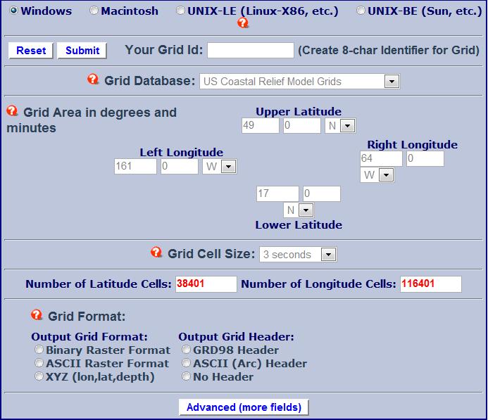
So, beginning at the top,
Choose your operating system,
Give the “Grid ID” (the output data set) a name – we’ll call it HILO3,
Choose “US Coastal Relief Model Grids” as your grid database. Note that the grid cell size is 3 seconds; at the equator 1 degree is 60 nautical miles (1 nm = 6080 feet) so 1 minute is 6080 feet and three seconds is ~ 300 feet. So the map doesn’t resolve area features less than this distance very well but it will show depth changes quite well.
Choose the grid boundaries (in this case the “Upper Latitude” will be 19 degrees 54 minutes North; the “Lower Latitude” will be 19 degrees 42 minutes North; the “Left Longitude” will be 155 degrees 6 minutes West; and the “Right Longitude” will be 154 degrees 58 minutes West)
For “Grid Format” choose “XYZ (lon, lat, depth) and leave the default values
Back at the top of the screen choose “Submit”; this will take you to a new screen.
Choose the “Compress and Retrieve your Grid” box without checking the other two options; another new screen will appear.
Choose “Retrieve” and save the resulting ZIP file to your desktop. In this instance, my file is named “HILO3-1556.zip”. The “1556” number will change to a different number each time a new request is made so if you don’t get “1556”, don’t worry.
Extract the file to your desktop. It should be named HILO3-1556.xyz in this example. At this point you need a mapping/plotting program. I highly recommend “DPlot” written by David Hyde. I have used this program for many years and have been uniformly happy with it. At $60 I think this is good, long-term investment. With DPlot you can take data directly from the XYZ file and begin plotting surface contours. This is what I’ll show you next. There is another program which is free called “QuikGrid”. It’s a little more fussy and requires that the input file is a .txt file which you can make from your Excel file, but it’s free…
So, if you choose to purchase DPlot, Open DPlot and enter Ctrl-O. Choose All Files and then the XYZ file that you just extracted. Now choose radio button “K” (3D or 4D – X,Y,Z…columns). A new pop-up appears with the data columns showing; choose “ok”. At this point a square color plot of the data appears.
Because the depth data are in meters and you would probably prefer either feet or fathoms, choose Edit, Operate on Z. Choose Z=Z/0.3048 to change meters into feet or Z=Z/1.8288 to change meters into fathoms. In my case, I’ll change meters into feet.
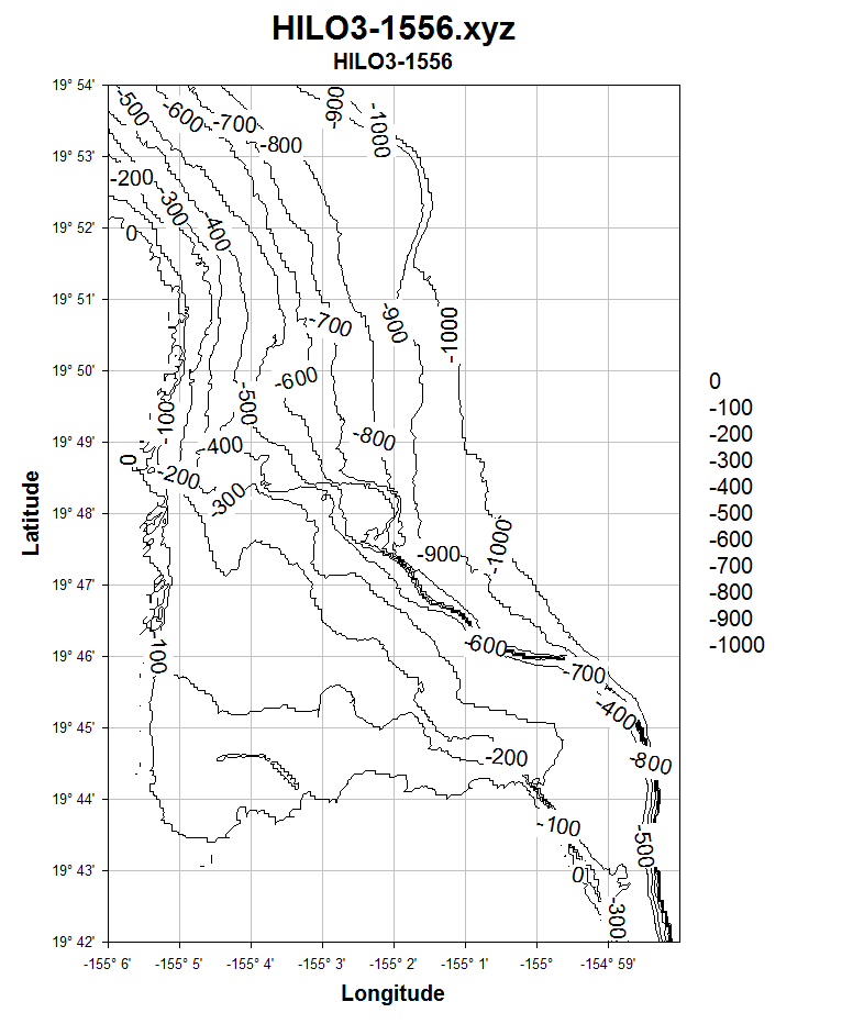
At this point, I choose “Options” and then “Contour Options”. This popup will give you the different options for your depth plot presentation. I begin by having both X and Y axes have the same scale factor (see bottom center). Now let’s go the “Lines/Levels” section and make the upper bound zero, the lower bound 1000 and the number of intervals 11. This gives us a map from sea level down to 1000 feet with 100 foot intervals for my example. Let’s also just make the first plot black lines. Go to “Colors” then choose “Custom” and make the number of intervals 1 and the color black. Now right-click on the axes values and choose “Degrees, Minutes”, then go to the Text section and label the axes “Latitude, degrees” and “Longitude, degrees”. Let’s also make the degree intervals easier to interpret. Right click on the axes values again and choose “Extents/Intervals/Size”, then go to “Tick Intervals” and click on the “Specify Interval” radio button. Now make the degree change 60 degrees for both axes and the depth interval 100 feet. You should now have a map that looks more or less like this:
Notice that as you run the mouse over the plot, the values of latitude, longitude and depth appear in a little box near the pointer, allowing you to note on the chart or write down for later insertion into your GPS waypoints listing for future investigation.
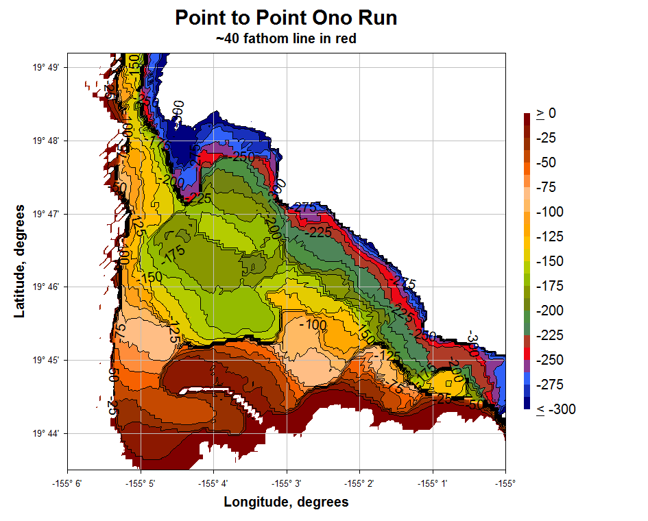
Let’s play a little more. Suppose you wanted to plot out the areas for a possible ono run beginning in the Onomea bay area. First go to Options, Contour Options, Type and choose “both lines and shades”. Then make the lower bound only 300 feet and the intervals only 25 feet. This gives 12 intervals. Increases the number of intervals to 24. In “Contour Lines” choose “Major Lines every 2nd Line”; in Draw choose label every 2nd interval. Then go to the Colors / Custom section and choose different colors for both highlighting the interval 225-250′ (I’ve chosen RED) and grading the colors away from the chosen “ono” colors. Now go to Options, Extent and change the Latitude upper bound to 19 degrees 49.2 minutes and the lower bound to 19 degrees 43.8 minutes. Also change the Longitude right bound to 155 degrees. Make sure that the scale factor remains at 1:1. Below is one possibility.
Pretty spiffy, eh? But we have to be a little cautious regarding how accurate the maps are. For example, the map completely misses all of the submerged shallow former reefs outside of the Blonde Reef that the Hilo breakwall sits on. Relatively large features (larger than several acres or so) appear to be visible but it’s important to actually go out and validate important features. To get a better feeling for this, let’s take a smaller 3 minute by 3 minute section from the above map and superimpose a 3 second grid on it. Each grid square is the approximate area that each data point depth-averages.

I think you can see that the possibilities are only limited by your imagination. Here’s one more example. Let’s do the plot in 3-D and look from the northeast direction at the result. We’ll also make the upper bound 50, the lower bound -1000 and the number of intervals 21. We need to play with the colors some more and continue with shaded bands. Here’s a plot with 3-D checked, using Gourand lighting and an ambient fraction of 0.5:
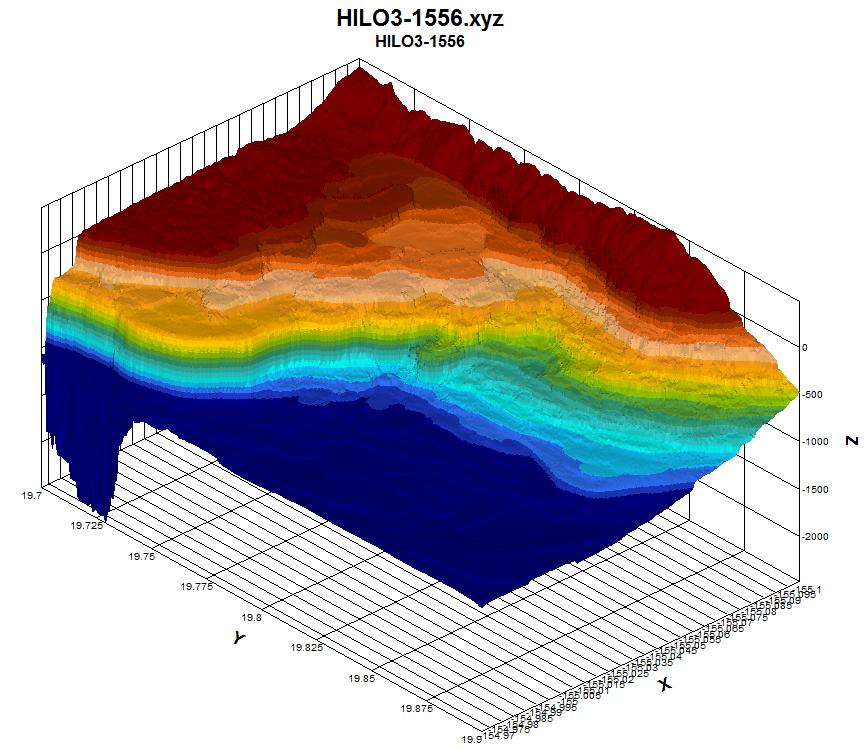
Good fun, yeah? Can you see the breakwall sitting on the Blonde Reef in the upper center portion of the picture? And the Onomea Bay channel coming in? The point-to-point aku run is in light beige. For other features, compare with the first plot. Of course someone with better color judgment than I have can easily make a more attractive plot. I’m sure readers can obtain a sense of additional possibilities for other areas to explore and different ways of highlighting desired features.